Intro to HTML and CSS workshop
In this tutorial, I’d like to introduce you to HTML and CSS. As with any new topic, there is much more to learn than can fit in a single lesson. So, my goal here is to give you a sense of the basic concepts involved with putting together the building blocks of a website. Below is a list of the learning goals for this experience. Students will be able to:
- Create HTML tags in a codesandbox and add content to a webpage that they can view in a browser window.
- Add
classattributes to their html tags to alter the appearance of those html tags. - Apply their understanding of the box model to adjust the spacing between the content of their webpage.
- Align content within their webpage.
- Adjust the font size of elements on their webpage.
- Adjust the colors of elements on their webpage.
- Apply their understanding of CSS Grid to create a 3 column grid to display images and text.
Stretch goals:
- Apply understanding of responsive design to adjust the Grid layout to respond to the screen size of the browser window (Grid will be 4 columns wide on large screens, 3 columns on medium size, 2 columns on small size and a single column for mobile devices).
Agenda
| Activity | Duration |
|---|---|
| How to use codesandbox.io | 5 minutes |
| Introduction to HTML and CSS | 20 minutes |
| Box Model demo | 5 minutes |
| How to Style Content with Vanilla CSS | 10 minutes |
| Introduction to CSS Frameworks | 10 minutes |
| Dimensions and the Display Property | 10 minutes |
| Building a Form using Flexbox and CSS Grid | 25 minutes |
| Wrap Up | 5 minutes |
What is codesandbox.io and how do I use it?
Codesandbox.io is an online platform that allows you to practice writing code that runs in the browser. The main languages of the web are HTML, CSS, and JavaScript. Codesandbox allows you to write code in these languages and view the results live on the web! This means that you can create something in the browser and share it with others by sending them a link to your website!
While you’re not required to set up an account with codesandbox to work along with me in this tutorial, creating a codesandbox account will allow you to more easily keep track of the code that you write during the workshop.
While you are learning, it’s important that you know where to go when you get stuck. For that, I’d always recommend google, but here are some important sites to look out for when you search:
Taking a playful experimental approach is best here. I like to come at problems with an expectation that things will probably go wrong along the way. When they do, I look for feedback from the browser developer tools and Google, to get a sense of why I’m getting the current behavior. After coming up with an explanation, I set up a little experiment to test the explanation. First, I propose a change to the code. Then, I predict what the result should be. Finally, I make the change, run the code, and see if I’m right. If so, I can move on with that approach, if not, I go back to the drawing board and try to figure out why things are happening the way they are. We call this process debugging!
It’s totally fine to not know why things are going wrong up front. At the moment, computers aren’t very forgiving–they want you to communicate in a very specific way–and it usually takes some coaxing to figure out why they’re not understanding what you wan’t them to do. You’ll develop your problem solving skills as you continue to learn about web development.
What is html?
HTML (HyperText Markup Language) is the most basic building block of the Web. It defines the meaning and structure of web content. Other technologies besides HTML are generally used to describe a web page’s appearance/presentation (CSS) or functionality/behavior (JavaScript). The Mozilla Developer Network (MDN for short) is a fabulous resource for reference as you learn more about code that runs on the web.
What is an html tag?
An HTML tag is a container for content that we want to include in our website. There are quite a number of different HTML tags that we can include to display content in different formats. This is an image from MDN describing the anatomy of an HTML tag.
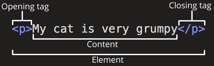
The main parts of our element are as follows:
- 1.The opening tag: This consists of the name of the element (in this case, p), wrapped in opening and closing angle brackets. This states where the element begins or starts to take effect — in this case where the paragraph begins.
- 2.The closing tag: This is the same as the opening tag, except that it includes a forward slash before the element name. This states where the element ends — in this case where the paragraph ends. Failing to add a closing tag is one of the standard beginner errors and can lead to strange results.
- 3.The content: This is the content of the element, which in this case, is just text.
- 4.The element: The opening tag, the closing tag, and the content together comprise the element.
Some HTML elements also have important attributes that we can set on them to customize how they behave. The syntax for that looks like this:
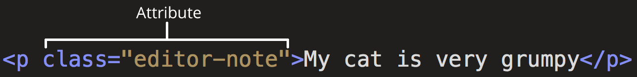
In the above example, the attribute is class and its value is "editor-note". The class attribute is commonly used in html tags to indicate that we want to apply styling to the element and any others that have that class applied.
Here are some examples that we’ll be learning about today:
HTML Tag reference
| Tag | Purpose | Important Attributes |
|---|---|---|
<html> | Wraps all of the content in our html document. | |
<head> | Contains metadata about our html document including the title and character encoding. We’ll also include links to external stylesheets here to embellish the display of our content. | |
<link> | Allows us to link external stylesheets to our html document. We’ll be using one of these today to load the tailwindcss library. | rel (the relationship between the linked file and this html document–most often ‘stylesheet’) href (the url from which the stylesheet is loaded) |
<body> | Contains the visible content of our html document. We’ll also include <script> tags at the end of the <body> tag to load interactive features into our site. | |
<h1> | Creates a header for our html document. Normally, the browser will apply a bold font and vertical margin to headers. When we apply the tailwindcss styles, we’ll see that it will reset our headers so we can decide manually what the styles should be. | |
<div> | Creates a block that we can use to divide our content into different sections. Two other HTML5 tags that perform a similar purpose but are more semantic are <article> and <section>. For now, it’s fine to use <div> tags to divide the page content into different containers. | |
<a> | Creates an anchor link that connects one webpage to another. Clicking on a link will move the browser to another location, sending a request to a server that will eventually lead to an HTML document as a response. The browser will take that document and render it to the window. | href (indicates the url–or anchor–to which the browser will move when the link is clicked) class (may be used to allow us to target specific kinds of links with our javascript, may also be used to indicate the desired styles for this link) |
<form> | The <form> tag allows users to submit data to a server that could result in creating, updating or deleting database records. Forms are the main way that we can add interactivity to our website. | method (indicates what type of request the form should send when submitted) action (indicates the url to which the form should send a request when submitted) |
<fieldset> | A semantic HTML5 tag that allows us to divide our form into multiple sections. The <fieldset> tag has a default display property of block, so it will stack on top of other fieldsets. | |
<label> | The <label> tag indicates to our user the purpose of a particular <input> tag. The label’s for attribute value should match the id attribute value of the corresponding input. Doing so will ensure that clicking on the label will bring the input into focus so users can type into it. | for (matches the id attribute of its corresponding input, establishing a connection between the two) |
<input> | The <input> tag allows users to enter data into a form that will be submitted to the server when the form is submitted. The type attribute will determine what kind of input this tag will create. Input types include: text, email, password, url, number, date, datetime, datetime-local, radio, submit. There are a couple of other tags used for inputting form data of note: <select>, which is used to create a dropdown input with a list of <option> tags. Also, <textarea> which is used to allow longer form text input. | type (indicates which type of input this tag will create) value (indicates the value the input will have within it when the document loads–useful for edit forms) placeholder (gray text that will be visible in the input when the field is empty–this disappears when the user begins to type in the input) id (allows the input to be more easily targeted by JavaScript and allows a connection between the input and its corresponding label) |
<img> | The <img> tag allows us to insert images into our website. | src (the url from which the image file will be loaded) align (establishes the relationship between an image and its position relative to the text surrounding it) width (for setting the width of the image in pixels) height (for setting the height of the image in pixels) alt (the text that will display if the image cannot be loaded–this is often used by screen readers to describe the image to blind users) title (indicates the text that will be displayed when a user hovers their cursor over the image) |
<p> | The paragragh (<p>) tag is a block element that contains text. Browser default styling adds vertical margin to the paragraph, adding spaces between the content above and below the paragraph. | |
<script> | The script tag allows us to add javascript content to our website.We can also use a script tag to store an html template that can be used by our javascript code to generate html that we can add into the document dynamically. | type (the type of script that will be loaded–most commonly “text/javascript”) src (the url from which the script will be loaded into the document) |
There are more html tags available to support all kinds of different content, but the above tags are the ones we’ll be looking at today.
What is CSS?
CSS stands for Cascading Style Sheets. We use CSS to describe the styling that we want to apply to our html document. In order to do understand better how this works, let’s talk terminology and explore an example.
h1 {
  color: red;
  font-size: 5em;
}

p {
  color: black;
}
Some terminology:
| Term | Description/Use Case | Example (from above) |
|---|---|---|
| CSS Selector | Used to describe which elements on the page should be targeted for styling. The two CSS selectors above are examples of element selectors. There are many other types of CSS selectors as well, but the most common one you’ll use at the beginning is the class selector. | h1 |
| CSS Declaration | each key: value pair indicates a CSS property and the value we want to apply for it. CSS Declarations will appear within the curly braces that follow the CSS Selector | color: red; |
| CSS Property | The name of the style attribute that we’re going to apply a value to within a CSS Declaration. Each property has a set of allowable values that can be explored by reading documentation on MDN. | color |
There are two main ways we can incorporate CSS into our HTML document. First, we can create a separate file for our CSS and then load it into our HTML document using a <link> tag. Second, we can actually add a <style> tag to the <head> of our HTML document and add our CSS within the HTML file itself.
Fundamentally, everything in an HTML is a box. We use CSS to determine how those boxes behave and interact both with their own content and the other boxes that make up the document.

How does the Box Model allow me to manipulate the spacing between elements on my site?
For spacing between html elements, we use the css margin property. For spacing between the border of an element and its content, we use the css padding property. The spacing between elements is also affected by the display property–we’ll talk about that in a bit. For now, it’s important to note that every element in an html document is a box. To get a better idea of what that means, let’s take a look at this interactive demo.
In this demo, as we interact with the sliders on the right hand side, you’ll notice that the css applied to the .box selector is changing. The main thing to note here is that the element at the top left has a class attribute of box (class="box"), which allows us to target it with css and adjust its style properties.
Let’s take a look at another example of a class selector (like .box) and declaration that will apply a red color to elements that have a class of red added to them.
<!DOCTYPE html>
<html lang="en">
  <head>
    <meta charset="UTF-8" />
    <meta name="viewport" content="width=device-width, initial-scale=1.0" />
    <meta http-equiv="X-UA-Compatible" content="ie=edge" />
    <title>Static Template</title>
    <style type="text/css">
      .red {
        color: red;
      }
    </style>
  </head>
  <body>
    <h1 class="red">
      This is a header!
    </h1>
  </body>
</html>
Notice that the class attribute is applied to the <h1> tag and its value is the word "red", while the CSS Selector we used to target that class is .red. The syntax indicating that a CSS selector is a class selector is that the selector begins with a .
Here’s how this would look in the browser.
As a demo, let’s open up this sandbox and add some styles here. Let’s say we wanted to make a few changes to how the header looks:
- Underline the text of the header.
- Add some spacing between the header and the edges of the window.
- Make the font size larger.
- Center the text
And then let’s say we want to create a paragraph below the header. This time, we want to add the spacing between the sides of the window, but we don’t want to center the text.
Then let’s add another header and use mostly the same styles but a different color.
You may notice when we do this that we end up repeating ourselves a few times. Let’s see what we can do about that repetition. This is a refactoring exercise. Code Refactoring is the process of reworking our code so that it’s easier to understand and reuse without changing how it actually works.
If this feels like a lot of work to do a small amount of styling, you’re definitely not alone in that feeling! For those of us who don’t feel like starting from scratch and making all of these classes for every project we do, there are CSS frameworks.
What is a CSS Framework?
A CSS framework is a library of code that includes a series of CSS declarations that you can reuse in your project. Here are some examples of CSS libraries you could use in your projects:
Each of these frameworks has its own look and feel, but they also have a design philosophy. While there are definitely variations, each of the frameworks above falls into one of two main camps.
Frameworks that fall into the first camp consist of a library of components. What that means is that there are established patterns for html tags and the classes you apply to them which will instantly give you the library’s signature look. A framework like this tends to add semantic CSS classes like btn or nav that may apply dozens of CSS declarations or more to an element. These frameworks tend to be easier to get started with and more difficult to customize–though that’s not always the case.
Frameworks that fall into the second camp consist of a library of utility classes. What that means is that they tend to have less opinions about the way things should look and you can generally customize with them more easily. That said, it also means that you’ll be relying more on your knowledge of css properties and what they do. Using a framework like this, you might find yourself using significantly more CSS classes to style something like a button or navbar, but you’ll have a much easier time making it look exactly the way you want it to.
How do I choose a CSS framework?
When deciding what CSS framework you want to use, the most important piece of that decision is going to be which approach you prefer. To get a sense of that, I think it’s a good idea to try out one of the more robust frameworks like Bootstrap and one of the utility frameworks like TailwindCSS.
In general, you’ll find that the more robust frameworks can help you set up a user interface for an application more quickly than the utility frameworks can but customization will require more learning and a detailed understanding of the framework to do effectively. By contrast, using a utility first framework, you can customize to the full extent of your desire only limited by your understanding of CSS itself. If you’re using components or templates built by other people, utility frameworks make it easy to keep the stuff you like and tweak the stuff you don’t.
Why are we using TailwindCSS for this workshop?
As a beginner, I think you’ll learn CSS more quickly by using a utility style framework. The reason for this is that all of the classes you add to elements describe the actual css properties that you are applying to those elements. This means that you’ll be able to see the effects of those properties on the elements they’re applied to more clearly. The reason for this is that you’ll have a shorter and more targeted feedback loop. What I mean by that is–when you make add a class to the element, the class name itself is a shorthand for the single css property you’re applying to the element. You’ll be able to see the effect of changing just that property on the element.
In a more robust framework like bootstrap adding a single class often adds dozens to hundreds of css declarations to the element. While this will make it easier to get something looking nice more quickly, it can oftentimes slow down your learning of how the css properties actually work.
The easiest way to get started using TailwindCSS is to add the following <link> tag to the <head> of your HTML document:
<link href="https://unpkg.com/tailwindcss@^2/dist/tailwind.min.css" rel="stylesheet">
If you add this line to the top of a codesandbox, you’ll be able to use all of the tailwind classes inside of that sandbox.
What is the difference between fixed and fluid dimensions?
Before we hop into an exercise to apply our understanding of the box model, let’s take a minute to speak about fixed vs fluid dimensions. Much like the name implies, a fixed dimension takes up a fixed amount of space. This can scale with the font-size of an element (in the case of the em and rem dimension units) or it can be a constant dimension (as in the px unit).
A fluid dimension takes up a fluid amount of space based on the context it appears in. The main thing that affects the dimensions of an element that has a fluid unit applied to it is the width (or height) of the viewport. As an example, if you set the width of an element to 50%, and the parent element that it appears inside of is 800px wide, then the element will be 400px wide. If you resize the screen so that the parent element is 600px wide, then the element will be 300px wide. We often use a combination of fixed and fluid dimensions when constructing a responsive design so that our content will look good no matter what device our user is using to visit our website.
What does the display property do?
The display property determines how the browser will display a particular element. The browser applies default display properties to various html elements that we add to our document. These properties affect the way those elements behave within the document. The article on the display property on MDN is a great place to learn more about how it works. These two paragraphs are taken from the top of that article:
The display CSS property sets whether an element is treated as a block or inline element and the layout used for its children, such as flow layout, grid or flex.
Formally, the display property sets an element’s inner and outer display types. The outer type sets an element’s participation in flow layout; the inner type sets the layout of children. Some values of display are fully defined in their own individual specifications; for example the detail of what happens when display: flex is declared is defined in the CSS Flexible Box Model specification. See the table at the end of this document for all of the individual specifications.
| Display Property | Description | HTML Tags |
|---|---|---|
| inline | Elements with the inline display property will appear as text that flows horizontally and fills only the space needed for its content. Unlike block elements, inline elements cannot have their dimensions set via css (width and height properties have no effect on inline elements). Lastly, top and bottom margin also do not affect inline elements. | <input>, <label>, <span>, <strong>, <b>, <i> |
| inline-block | Like inline elements, elements with the inline-block display property will flow horizontally and fill the space needed for their content. However, like block elements they can have their dimensions set via css using the width and height properties. Inline-block elements can also have vertical margins applied to them. | <button>, <img/>, <select>, <textarea> |
| block | Elements with the block display property will fill the entire width of the parent element they appear within, regardless of the size of their content. Block elements that appear next to each other in your HTML will generally stack on top of each other. The height of block elements will automatically grow as the content with them grows in size. You can adjust their dimensions using the width and height properties and you can set margin on all sides. | <form>, <p>, <div>, <nav>, <section>, <article>, <fieldset>, <figure> |
| flex | CSS Flexible Box Layout is a module of CSS that defines a CSS box model optimized for user interface design, and the layout of items in one dimension. In the flex layout model, the children of a flex container can be laid out in any direction, and can “flex” their sizes, either growing to fill unused space or shrinking to avoid overflowing the parent. Both horizontal and vertical alignment of the children can be easily manipulated. (from MDN) | None by default, this property must be applied. |
| grid | CSS Grid is used in situations where you’re looking to create a layout in two directions. Early on in the development of the web, HTML tables were used to determine the layout of a page. One of the downsides of that structure, beyond the requirement of lots of extra html tags, is that it didn’t allow for the content to reformat as smaller screens became more prominent. CSS Grid allows us to create 2 dimensional layouts with customized dimensions for grid cells using a single container and a collection of children, meaning that grid properties can be set based on media queries. This allows us to easily create a layout using the same html markup that will respond to different sized screens. | None by default, this property must be applied. |
This is not an exhaustive list of all the possible display properties, but it will give us enough background to go through today’s main exercise. If you’d like to learn more about these properties, feel free to check out the resources below.
Resources
- Using CSS Grid with TailwindCSS
- 6 Minute Video on Using Flexbox with Tailwind
- 4 minute Video on Display Property
- 15 minute video on Flexbox
- 20 minute video on CSS Grid
- The Display Property and Flow Layout
How do I get high quality images for my website?
All of the above are good options for getting high quality images that you can use for your website for free. Obviously, you’ll probably want to have your own imagery as well, but these can be good sources for prototyping. The easiest way to use these sites is to find an image you like, right click on it, and select “Copy Image Address”

What are self-closing tags and when do I use them?
The two examples you’ll see most often are <img /> and <input />. The reason they are self closing is that it doesn’t make sense for them to have content within them. Rather, they are containers which will hold information related to one of their attributes. In the case of <img>, the container will display the image stored at the url in its src attribute. In the case of the <input>, the container will display the contents of the value attribute. You can read more about self closing HTML tags if you like.
What is responsive design and why do we need it?
Responsive design is the process of designing a website with different size screens in mind. The idea is that your CSS selectors will be targeted at particular breakpoints in the design. They’re called breakpoints because they represent screen sizes which will cause your design to break. There is a CSS technique known as a @media query that allows you to define CSS rules that only apply when the device’s viewport fits within a specified range of widths. We use responsive design techniques to ensure that our website displays properly on mobile devices as well as on laptop and desktop computers. Simply put, we write our styles so that items stack on top of each other on mobile devices, while they may spread out horizontally into columns on larger screens.
How does tailwind help us build responsive layouts?
TailwindCSS comes with a full set of classes that begin with a prefix matching each of the screen size breakpoints. For example, if we have a grid layout, we can do something like this:
<div class="grid sm:grid-cols-2 md:grid-cols-3 lg:grid-cols-4">
</div>
And this will create a single column grid for mobile devices, a 2 column grid for small sized screens, a 3 column grid for medium sized screens, and a 4 column grid for screens large size and up. The prefixes can also be used to apply a different font-size to different sized screens, or a different amount of height or padding to an element. TailwindCSS makes it extremely easy to customize your responsive design to pin point the styles you want to apply to a particular element at a particular screen size.
The Main Event!
The main exercise for the day is going to involve building out a form which can accept a Title, Description and Image URL and a grid to display the results. This is what we’re building towards.
And here’s where we’ll start from:
There is some javascript in this codesandbox. Its purpose is to handle the submit event triggered by clicking our Add Image button. When we submit the form, our javascript will take our inputs, pull out their values and render them into a template in our html file. We’re using a library called Handlebars.js to do this. The main thing it allows us to do is to create a template function that accepts an object (key-value pair data strutcure) and returns some html with content from that object inserted. We can then use javascript to put that html into our webpage. Getting too deep into this is beyond the scope of today’s workshop, so the main thing we’re going to be doing today is editing our template so we can tweak the way our images are displayed.
Further Study
How to use the Align Property on Images
To see how you can use an image within an article and have text wrap around it, check out the codesandbox below.